Home > Exhibits > Painting > Capture
Home > Exhibits > Photography > Capture

This is a show that took place at Corktown Studios in February 2014. Each photograph was paired with a painting (except for Amanda Kane's Fireball: View of a Lifetime, which, with its vivid colors looks like it could be a painting).
Digital photography has revolutionized many areas of artistic endeavor, including painting. Many painters paint from photographs, saving their models hours of standing or sitting still. However, using photographs in this way also presents new challenges. For instance, painters now need to understand how the camera distorts, and make crucial decisions on how to use that understanding. Capture explores the relationship between photography and painting by showing both photographs of paintings, as well as paintings of photographs.
In some cases, the relationship between the painting and the photograph is quite obvious, in others less so. Regardless of how direct this seems to be, there are subtleties that go beyond merely rendering an image in another medium. The painter can consciously decide to omit an image element altogether, for example. The photographer also has the means to leave things out; some of those methods cross the line into painting.
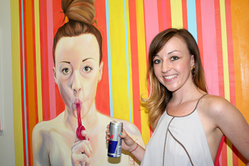
There can also be the issue of layers of indexicality, a concept that is actually simpler than it sounds, and is very well illustrated by Alonso del Arte's photograph Michelle's Sweet Tooth. This photo and the accompanying painting by Kelly Guillory, also touch upon the different ways one person is seen by four different people, including herself. The person is Michelle Tanguay, a brilliant artist who has received some well-deserved recognition at the Red Bull House of Art and afterward.
One of Michelle's paintings for the Red Bull House of Art, Round 2, was a self-portrait with a Twizzler. Thus in the photo, the painter appears next to her own painting, but on both sides of the image we have representation. Who are we to say one representation is more valid than the other? Can we argue that the photograph accurately recorded the surface details but tells us nothing of Michelle's soul, or that the painting shows us her soul but idealizes her physical surface? Those would be oversimplifications. "I see an innocence in her," Al said, "and I think that comes through in my photo."
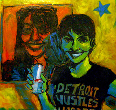
When it came time for Kelly Guillory to do a painting based on Al's photograph, the issue of layers of indexicality came up. In the photo, it is quite clear which representation is the painting. But how would Kelly make this clear in her own painting? A literal reworking of the photo as a painting would not have been as successful, even with a painter as skilled as Kelly. One parameter was decided for her early on, but she still had a lot of decisions to make. "I decided that in Kelly's painting, the painting-within-a-painting would be smaller, so that the edges of it would fall within the edges of the overall image," Al explained.
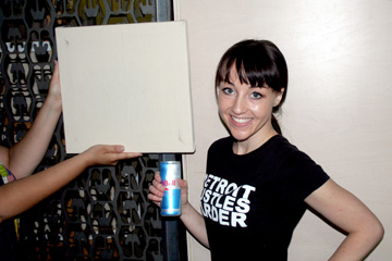
The painting within Kelly's painting uses only two colors: orange and black, color choices that would seem to impede the depiction of shadows. Kelly overcomes this problem by using a shade of blue to represent the shadows Michelle casts on her own painting (which are just barely seen in Al's photo and not at all in the mock-up. An interesting detail to point out about that mock-up is that it shows the same canvas that Kelly would paint on.
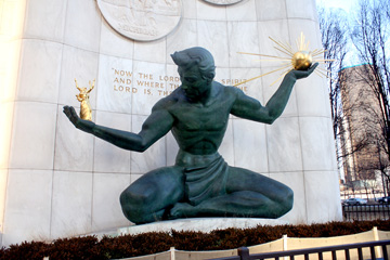
There were no sculptures in the show, but the Spirit of Detroit statue by Marshall Fredericks inspired one of Kelly's paintings. Just a little bit of historical background on the statue is in order here. The sculptor worked on the statue in the 1950s and it was dedicated in 1958; he did not give it a title, but the 2 Corinthians 3:17 quotation led people to call it The Spirit of Detroit.
The most obvious change in Kelly's painting is that the Spirit stands, though still holds the globe in one hand and the people in the other. Although it is obvious that the large figure in the sculpture is a man, the figure in Kelly's painting is a spirit, neither a man nor a woman. The Spirit comes from the imagination.
So when Al suggested to Kelly that there be a photograph based on her painting, it became necessary to find an actual person to embody the Spirit. Kelly chose a woman for that purpose, and J. Singleton photographed her in January [WAS IT JANUARY? DOUBLE-CHECK]
Which then to the [PLACEHOLDER FOR REST OF SAL'S PARAGRAPH]
"When Haneif [Katebi] told me his friend Hamed [Habhab] was going to make a photo based on his abstract painting, I was skeptical," Al recalled. "But when I saw Hamed's photo, I was convinced."
[PLACEHOLDER FOR IMAGE] [PLACEHOLDER FOR TEXT] [PLACEHOLDER FOR IMAGE]One of the neat things about painting is how easily it can go to any season. Originally, Lisa Poszywak's painting Hot Mama was going to be in the show. The scene, from a hot summer day, proved rather impractical to enact during one of the coldest Michigan winters any of the artists in the show can remember.
So instead Al opted for Dark Potentials, a scene from the Sugar House, a bar very near Corktown Studios.
[PLACEHOLDER FOR IMAGE]But the problem of season was still manifest for Sanda's photo. Her first attempt, while a very nice photo, was too Christmasy. Sanda tried again and succeeded with a bar in the suburbs.
[PLACEHOLDER FOR IMAGE]One of the regrettable effects of excessive digital image manipulation in today's advertisements is how Photoshop has become almost synonymous with dishonesty. "People forget or don't even know that professionals almost never publish photos straight off the camera," Al explains. "A camera lens is much different than a human eye, and that means that in order for the image from the camera to match what the photographer saw with his own eyes, some basic adjustments have to be made."
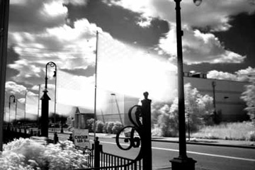
One aspect cameras often get wrong is color balance, although some new cameras have gotten smarter about detecting and correcting color casts, such as excessive green from fluorescent lights. But to this day, snow in sunlight remains problematic. [A LITTLE MORE ABOUT SNOW PHOTOS GOES HERE]
Photojournalists have gotten in trouble for using Photoshop to delete objects from their images, one of the most famous examples being a freelance war photographer on contract for the Associated Press [DOUBLECHECK] who deleted a video camera from a war scene.
Al has never photographed in a war zone, but he does have some experience with photojournalism and the dilemmas that can sometimes arise. But since it was never his intention to run his Flags on the Fifth of July photo in any news publication, he could have used Photoshop to remove the chicken leg quarters placard from the image. He did not.
The poet James Griffin read a lot into that decision. "You must have been hungry when you shot that," Jim told Al. Jim then went on to comment about the immigrant experience and write a poem on the subject.
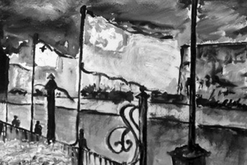
For her take on the image, Sanda decided to leave out the chicken leg quarters placard. A perhaps more important difference in Sanda's take is that she made the flags' blue field a little bit more obvious.
For some photos from the opening reception, see this page from the Corktown Studios website.